

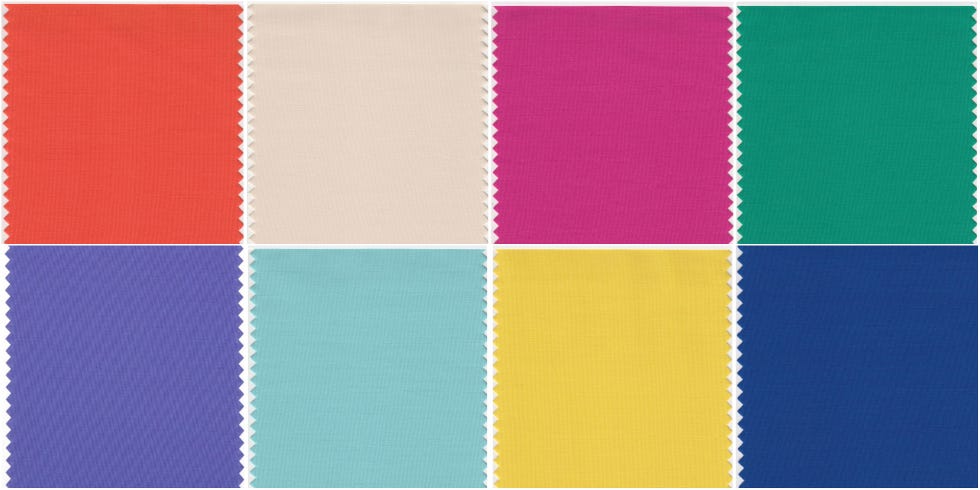
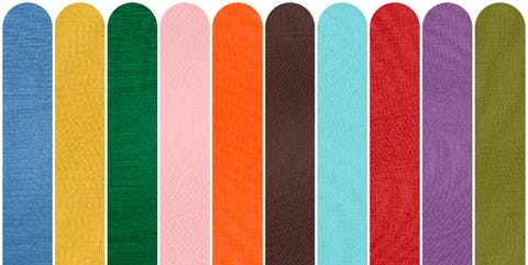
Every single Pantone Colour of the Year from 2000 – 2022
What's been your favourite?
For the Pantone Colour of the Year selection process, colour experts at the Pantone Colour Institute comb the world looking for new colour influences, from the entertainment industry to fashion, travel destinations and socio-economic conditions. Influences can also stem from new technologies, materials, textures, social media platforms and even upcoming sporting events that capture worldwide attention.
Then towards the end of each year, a defining colour for the forthcoming year – better known as the Colour of the Year – is announced. The new 'It' colour is typically announced early December.
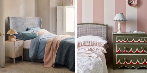
Pantone's Colour of the Year has been going for more than 20 years, influencing products across fashion, home furnishings, and industrial design.
Here we take a look at all the defining colours chosen by Pantone so far…
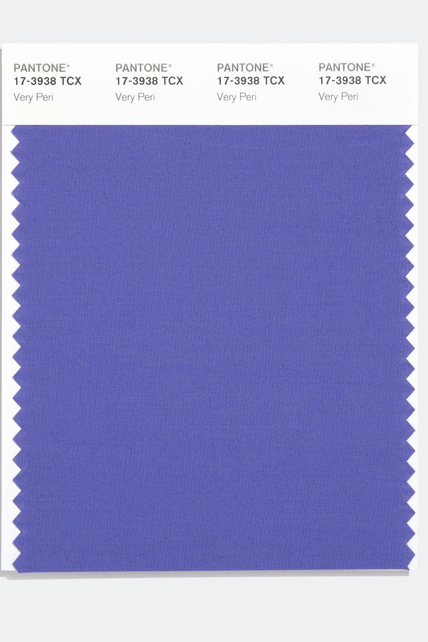
Very Peri is a dynamic periwinkle blue hue with a vivifying violet red undertone. Futuristic in feeling and encouraging inventiveness and creativity, Very Peri blends the faithfulness and constancy of blue with the energy and excitement of red. A brand new shade, it's the first time Pantone has created a new colour in the history of its Colour of the Year forecasts.
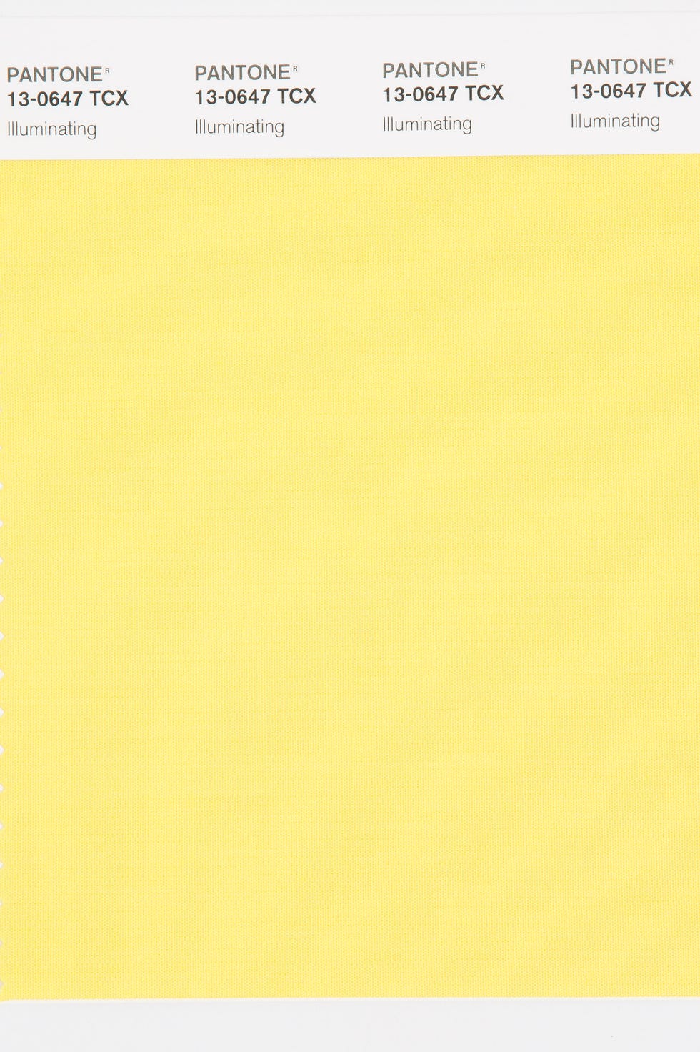
For the second time, the blending of two shades – Illuminating and Ultimate Grey – are chosen as the Pantone Colour of the Year.
Illuminating is a bright and cheerful yellow sparkling with vivacity; a warming yellow shade imbued with solar power.
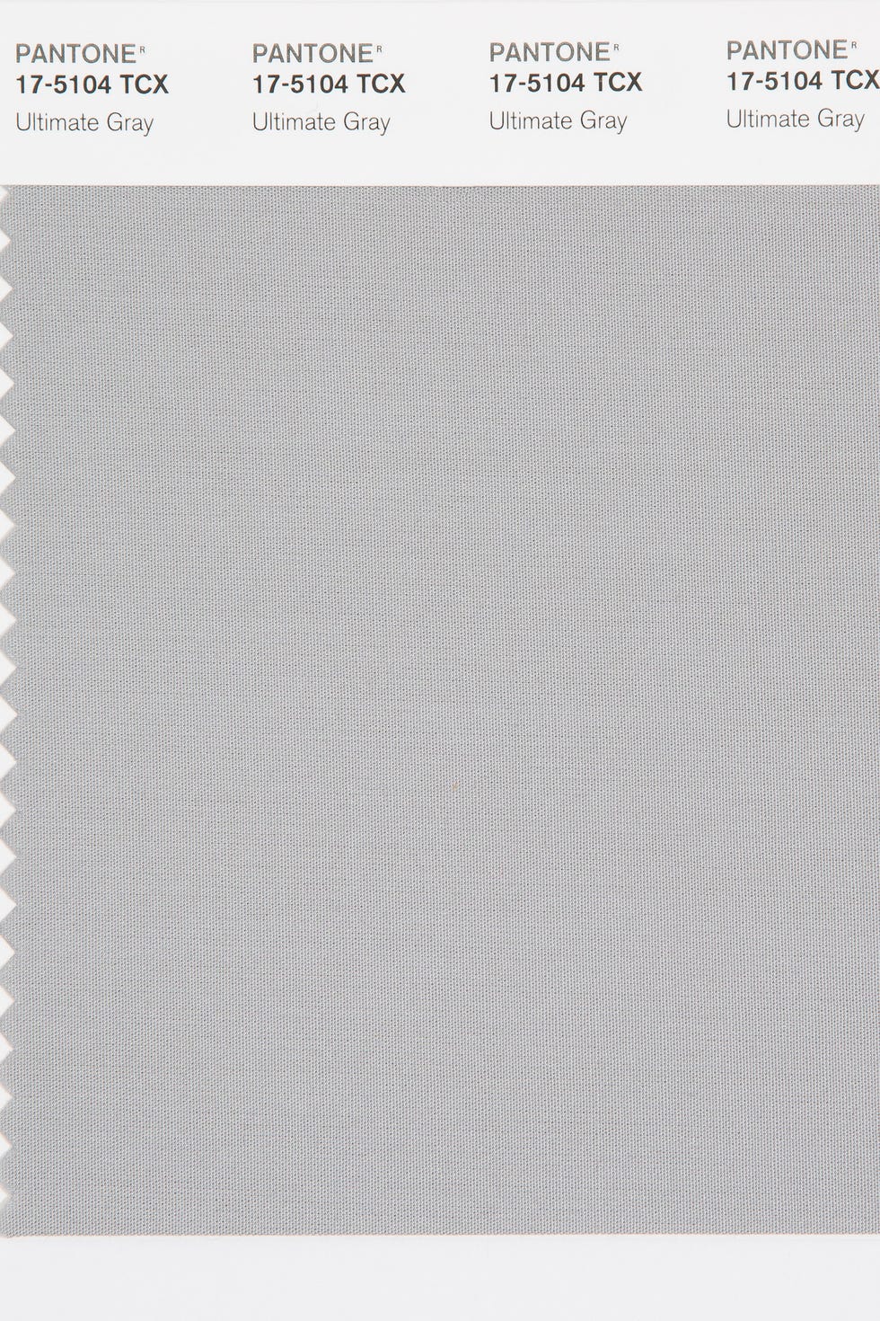
For the second time, the blending of two shades – Illuminating and Ultimate Grey – are chosen as the Pantone Colour of the Year.
Ultimate Grey quietly assures, encouraging feelings of composure, steadiness and resilience. The versatile grey shade resembles pebbles on the beach and natural elements whose weathered appearance highlights an ability to stand the test of time.
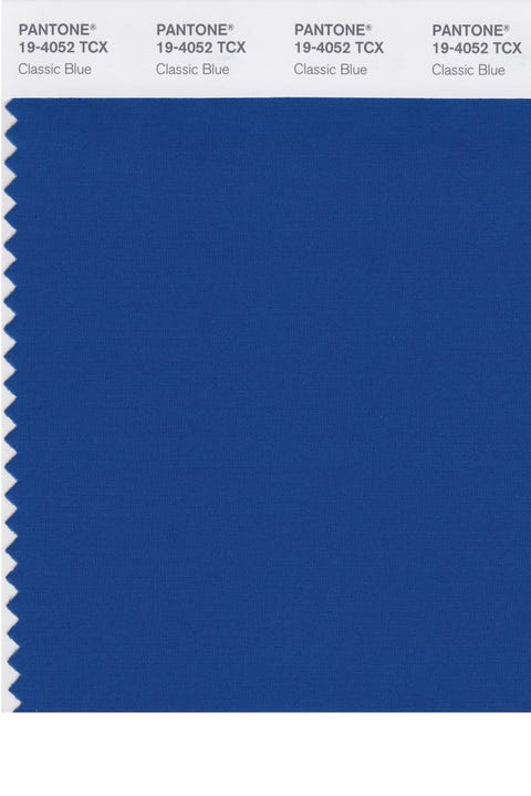
An expansive presence, Classic Blue is evocative of the vast and infinite evening sky opening a world of possibilities.
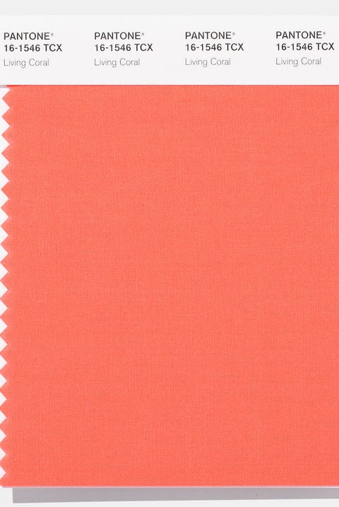
Living Coral is an animating and life-affirming coral hue with a golden undertone that energises and enlivens with a softer edge.
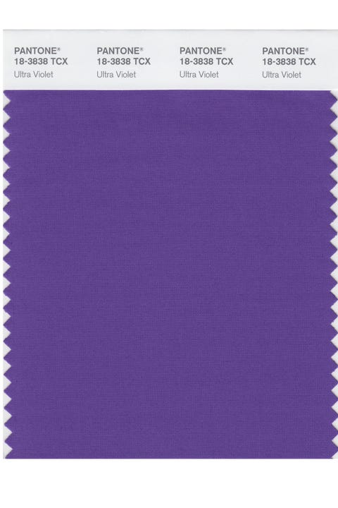
A dramatically provocative and thoughtful purple shade, Ultra Violet communicates originality, ingenuity, and visionary thinking that points us towards the future.
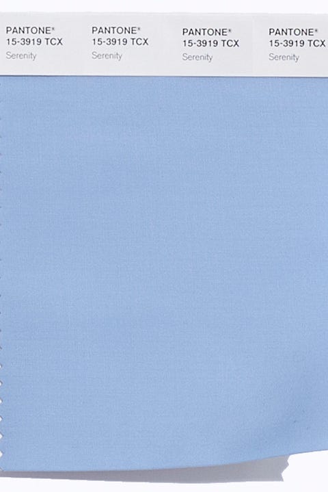
For the first time, the blending of two shades – Serenity and Rose Quartz – are chosen as the Pantone Colour of the Year.
Serenity is weightless and airy, like the expanse of the blue sky above us, bringing feelings of respite and relaxation even in turbulent times.
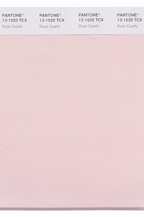
For the first time, the blending of two shades – Serenity and Rose Quartz – are chosen as the Pantone Colour of the Year.
Rose Quartz is a persuasive yet gentle tone that conveys compassion and a sense of composure.
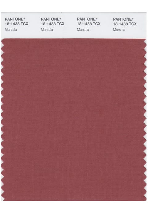
A naturally robust and earthy wine red, Marsala enriches our minds, bodies and souls.
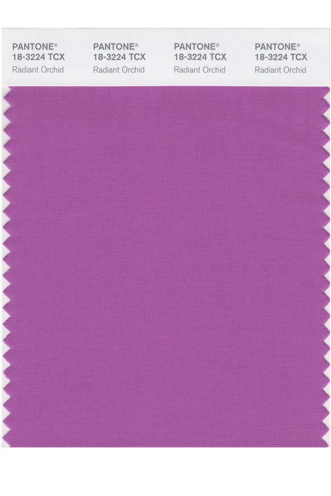
An enchanting harmony of fuchsia, purple and pink undertones, Radiant Orchid inspires confidence and emanates great joy, love and health.
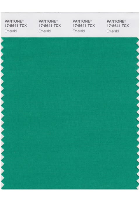
A luminous, magnificent hue, Emerald is the colour of beauty, new life and prosperity.
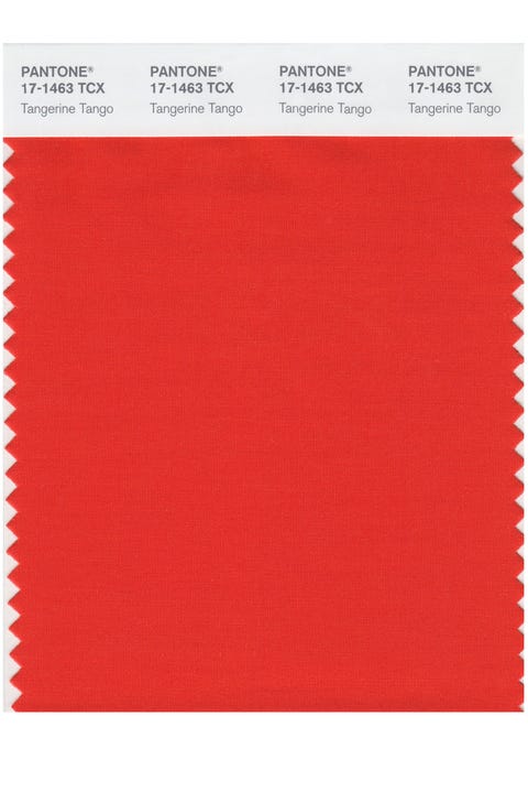
Reminiscent of the radiant shadings of a sunset, Tangerine Tango is a vivacious, magnetic hue that emanates heat and energy.
A bright, sherberty pink shade, uplifting and optimistic, evoking nostalgic feelings of summertime.
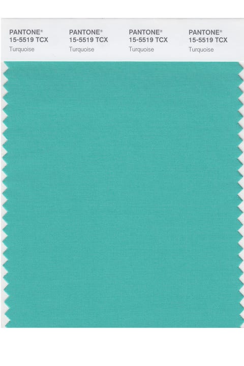
Combining the serene qualities of blue and the invigorating aspects of green, Turquoise inspires thoughts of soothing, tropical waters and a comforting escape from the everyday troubles of the world, while at the same time restoring our sense of wellbeing.
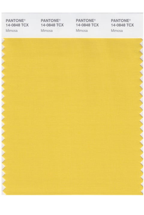
A warm and engaging yellow. In a time of economic uncertainty and political change, optimism is paramount and no other colour expresses hope and reassurance more than yellow.
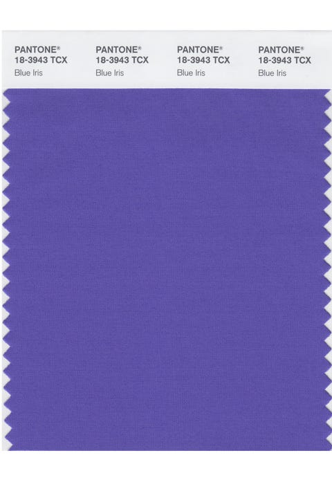
Combining the stable and calming aspects of blue with the mystical and spiritual qualities of purple, Blue Iris satisfies the need for reassurance in a complex world, while adding a hint of mystery and excitement.
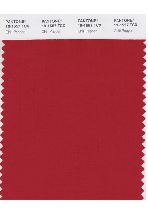
A deep, spicy red, its boldness is appealingly eye-catching, sophisticated and enticing. Chili Pepper connotes an outgoing, confident, design-savvy attitude.
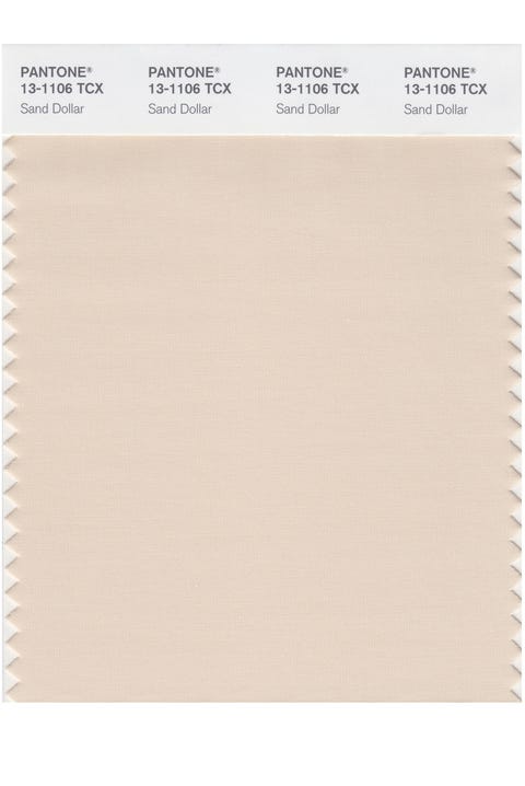
Natural and organic, Sand Dollar – considered to express concerns about the 2006 economy – is a warm shade that relaxes and soothes nerves. It is also reminiscent of the desert and soft sandy beaches.
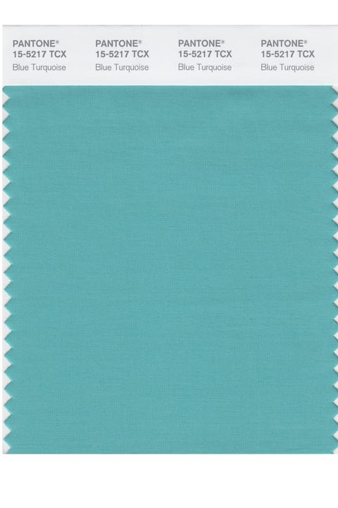
Taking inspiration from the colour of the sea, the calming and reassuring Blue Turquoise is gentler in tone than true Turquoise.
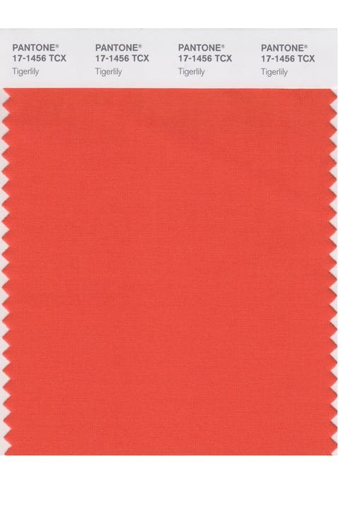
Bright, bold, passionate and rejuvenating, Tigerlily contains red and yellow and draws its inspiration from the flowers around us.
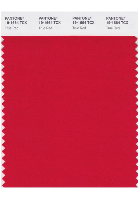
A vivid red, associated with love, passion and power, and chosen for its deep and meaningful hue.
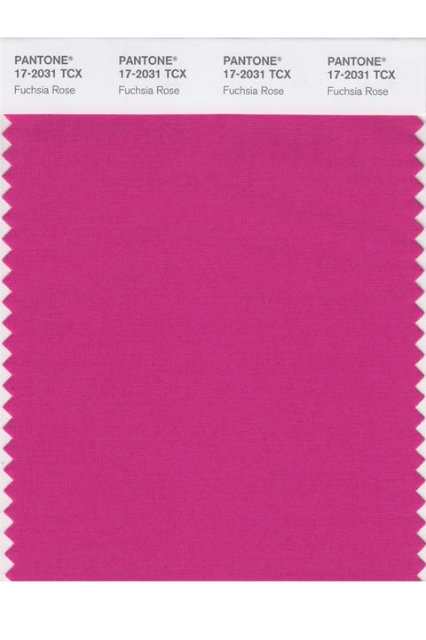
A bright, feel-good feminine colour, Fuchsia Rose is passionate, intense and exciting, yet also warm and endearing.
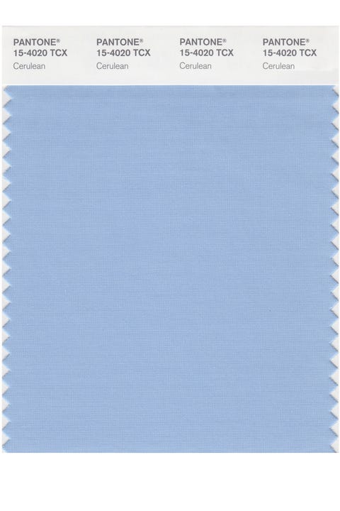
The official colour of the millennium is Cerulean Blue; the colour of the sky on a serene, crystal clear day. It connotes restful, peaceful and relaxing times.

- Christmas
- Decorate
- Garden
- My New Home
- Kitchens
- Shopping
- Celebrity Homes
- Small Spaces
- Property
- Chelsea Flower Show
- Contact
